HOW TO USE THE RAINBOW IN GRAPHIC DESIGN
HOW TO USE THE RAINBOW IN GRAPHIC DESIGN
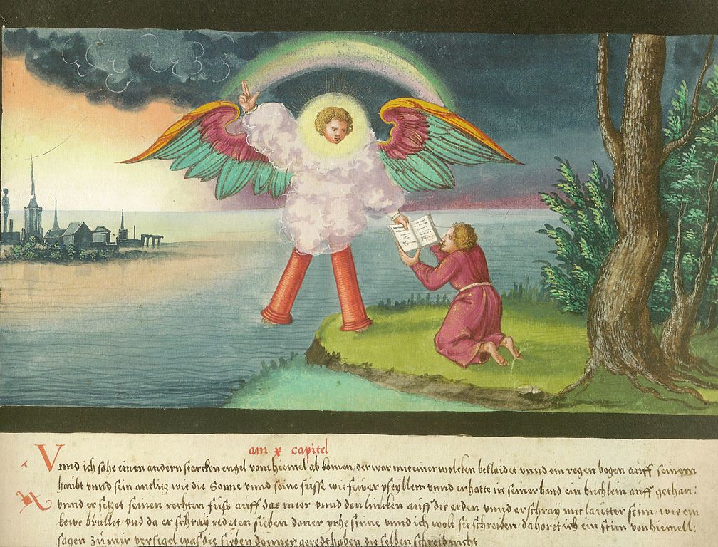
You can imagine how the rainbow must have looked to early humans: supernatural, majestic—maybe even terrifying. It’s no wonder that it has shown up so often in our cultural iconography. With classical art, the rainbow was seen mostly in a religious context—the kaleidoscopic arc acting alternatively as a herald of divine favour or a herald of the apocalypse.
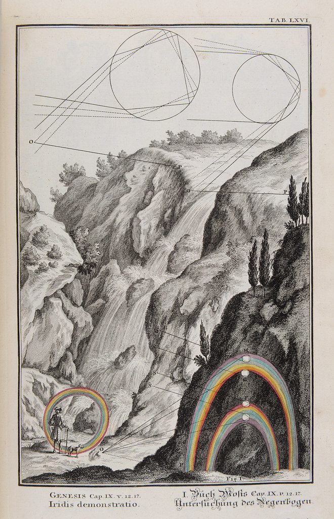
Advances in science led to the rainbow’s portrayal as more of a wonder of mathematical precision within the natural world. Nowadays, the rainbow is the universally recognised symbol of solidarity within the LGBTQ community. And of course, we all have Lisa Frank to thank for the inescapable rainbows that coloured our childhoods.

Artists throughout the ages have been attracted to the rainbow for all of the above reasons but most obviously for its extravagant colour scheme. It’s multi-coloured ways can also make the rainbow challenging to work with. Most designs are limited to about three colours or less (due to printing expenses). So, a seven colour scheme? That’s a tough one—even for experienced designers.
How do you incorporate all of those colours in equal measure without making your design look gaudy? How do you make any one element stand out in a sea of vivid colours? We’re going to explore the solutions designers have come up with for these problems and the 9 awesome ways you can use the rainbow in your design.
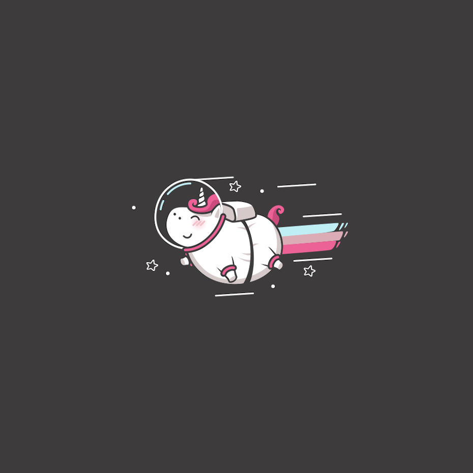
Pair the rainbow with neutral tones
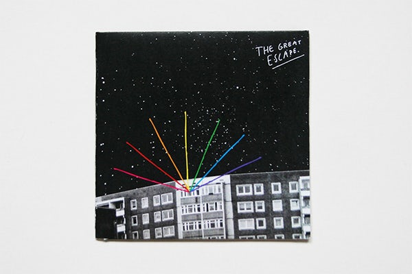
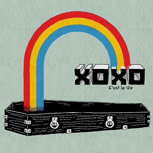
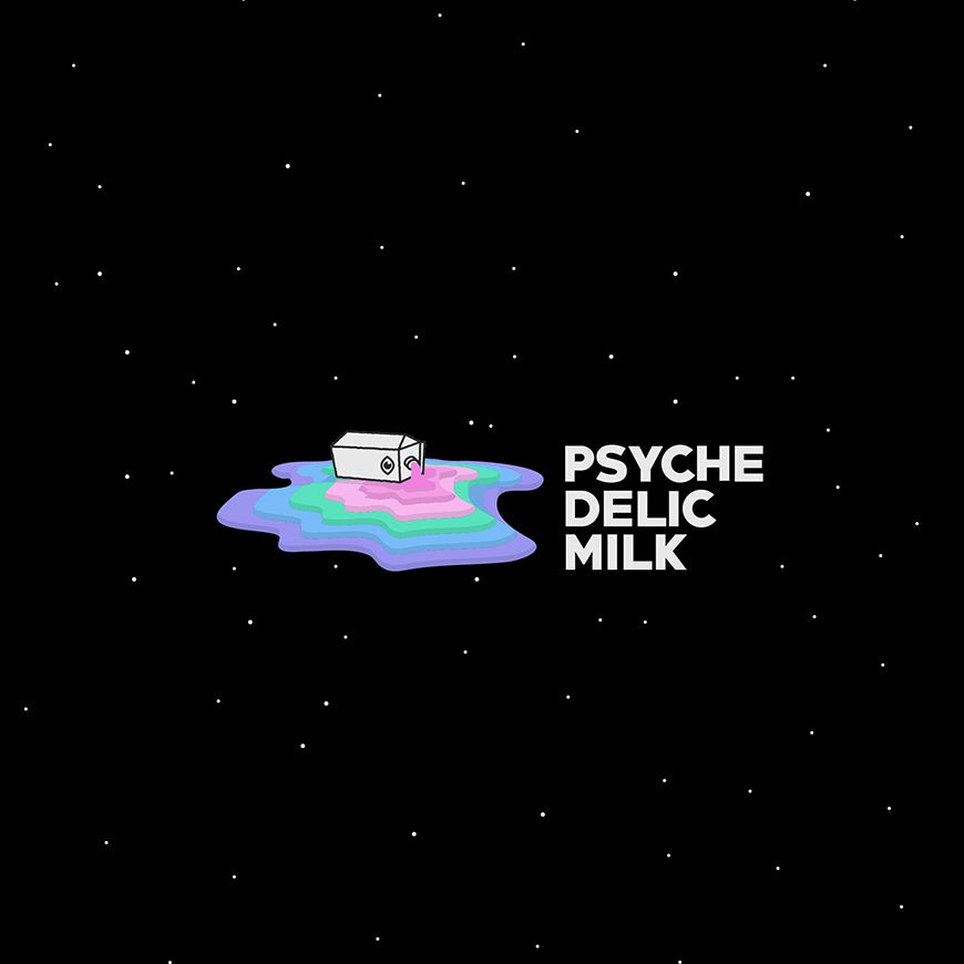
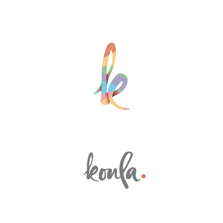
Ever since Dorothy was whisked out of dull, sepia-toned Kansas into a technicolor dreamland, there has been a divide between the world of the neutral and that of the rainbow. But this contrast doesn’t have to be negative.
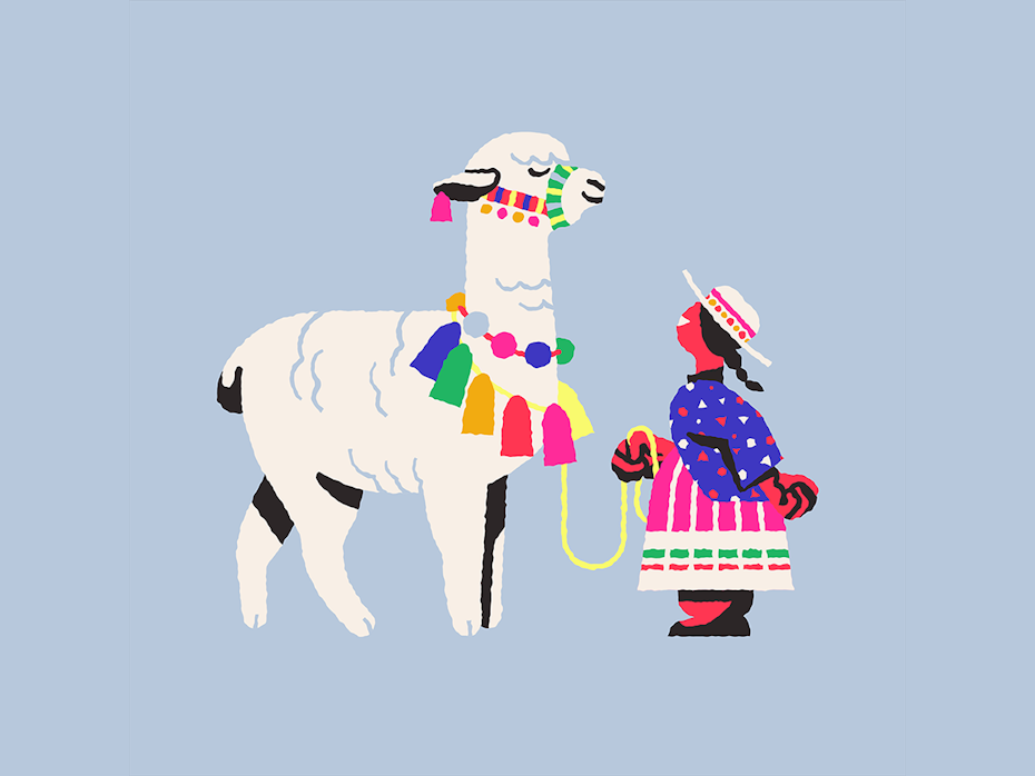
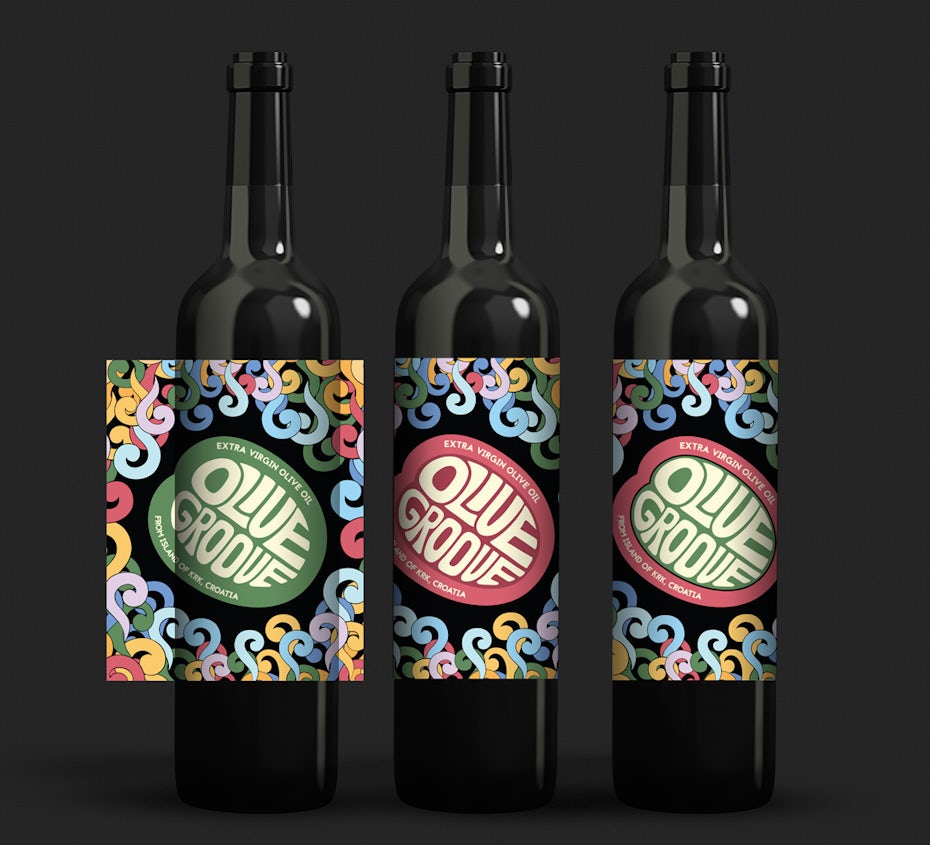
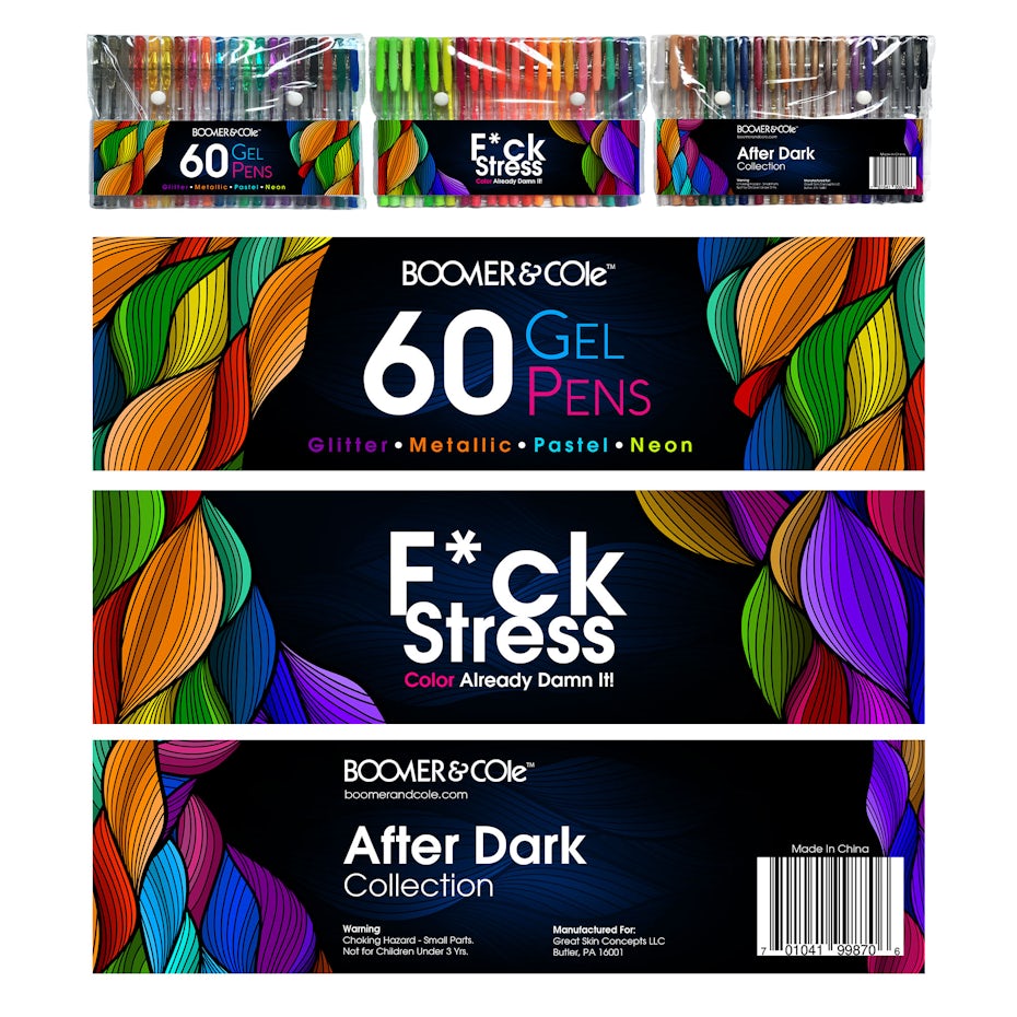
Neutral tones—that is, greys, whites, blacks and beiges—can represent all that is mundane and ordinary, but they can also provide balance and contrast to the intense vibrancy of the rainbow. Designers can amplify this effect by using strategic bursts of rainbow within a largely dark design, adding a glimpse of magic in a moody composition.
 by Cheng Chieh Sung via Behance
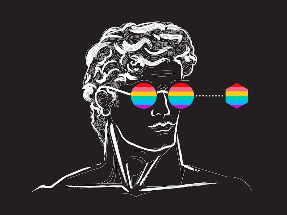
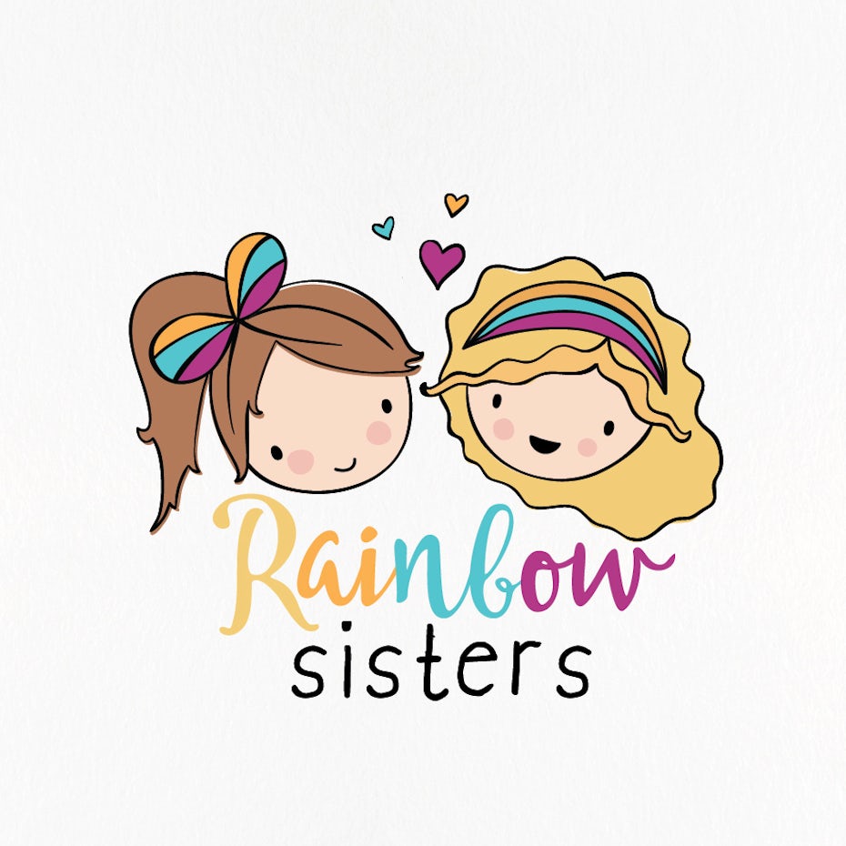
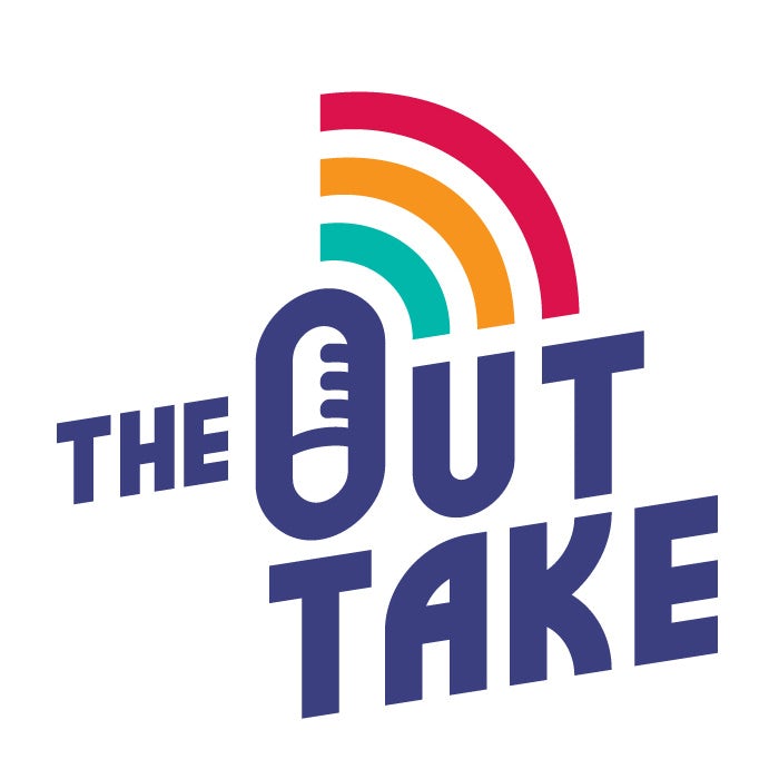
Subtract some of the rainbow’s colours
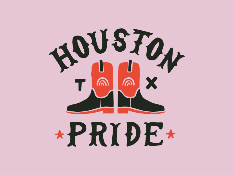
The rainbow is a striking symbol but also a fairly recognisable one. Even when its colours are reduced by half, viewers are able to connect the dots and understand that these fewer colours are meant to represent the full rainbow.
Context and contrast are both helpful here. If you are only going to use three of the rainbow’s colours, make sure there is some variety to them (think triadic colour scheme). A few colours within a familiar rainbow setting (such as a series of arcs or a unicorn’s tail) also makes it obvious that these are rainbow colours, even though not all of them are present.
Keep in mind that for LGBTQ purposes, this might not always be the best design solution if you want to stay true to the intended symbolism behind each colour in the pride flag. That said, LGBTQ folks are definitely accustomed to seeing the rainbow commonly, so you can get away with a more casual version like the Out Take logo below.
by Jerrod Landon Porter via Behance
by CrateCo.
by ananana14

by Steven Ou
by El-Za
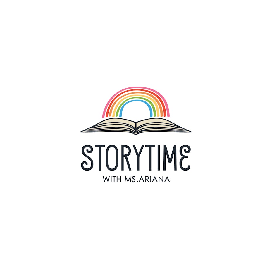
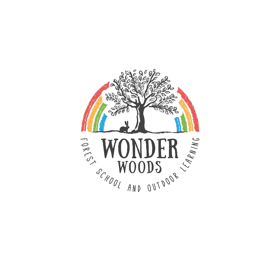
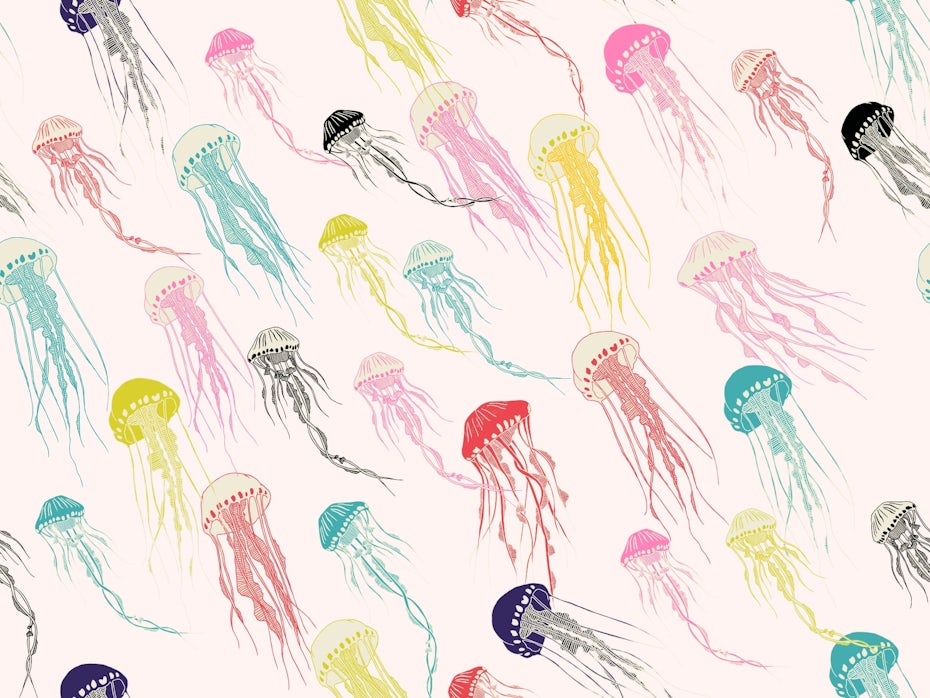
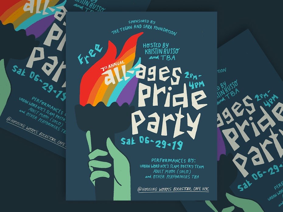
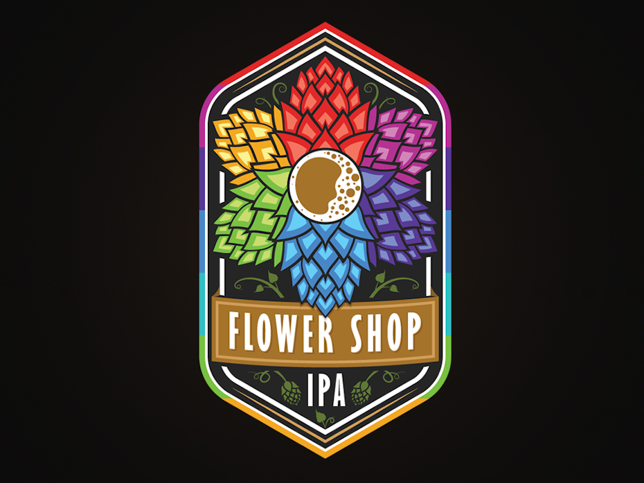
Separate the Rainbow
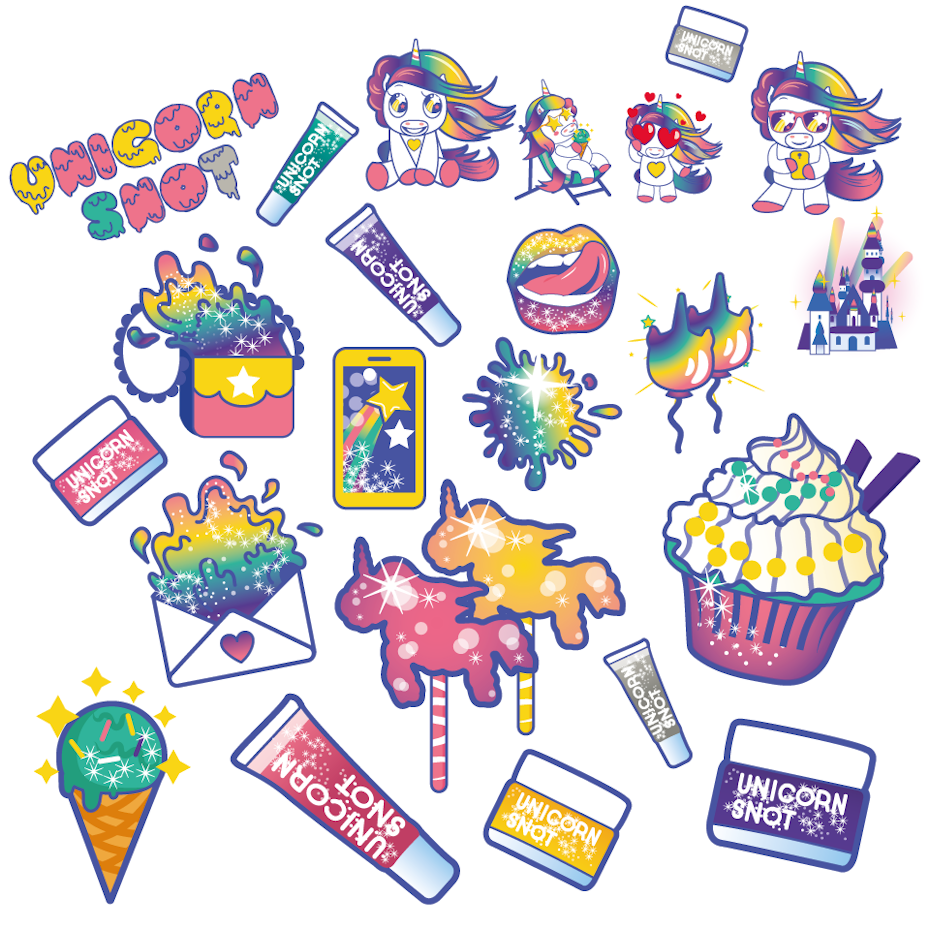
The multitude of colours in the rainbow can be overwhelming in design. The fact that these colours are usually portrayed all together, one on top of the other only heightens their intensity, sometimes in a way that’s not desirable.
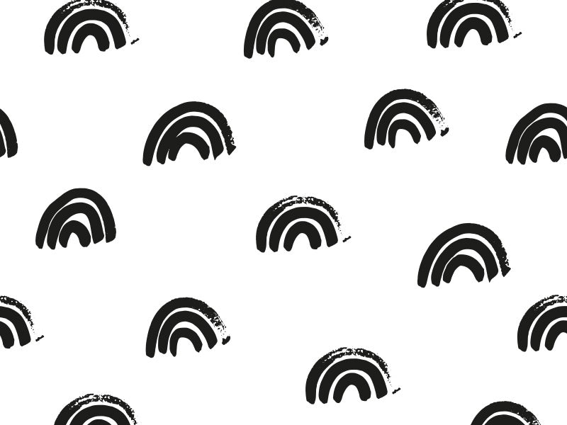
Though rainbow colours have a side-by-side appearance in nature, designers can and should take artistic liberties. As long as the colours are all there, you can separate and place them however you want in your design. This technique is especially useful in character illustration or patterns, where you can attribute single colours to separate elements. It may sound like you are diminishing the rainbow’s power, but think of it as sprinkling the rainbow all over your design. When you view the composition as a whole, it all comes together to give you the full impact of a vivid rainbow.

by JohnBaiatul
by TikaDesign

by Doljirung via Dribbble
 by Camille Pagni via Dribbble
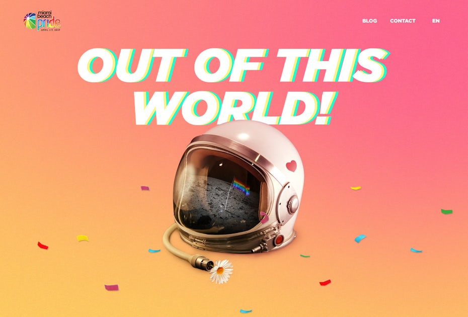
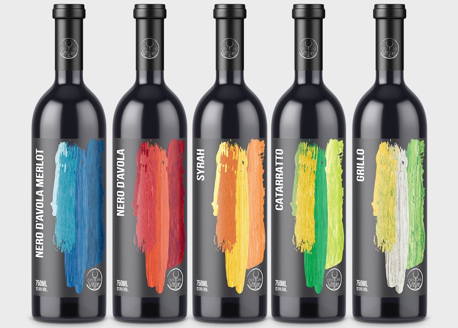
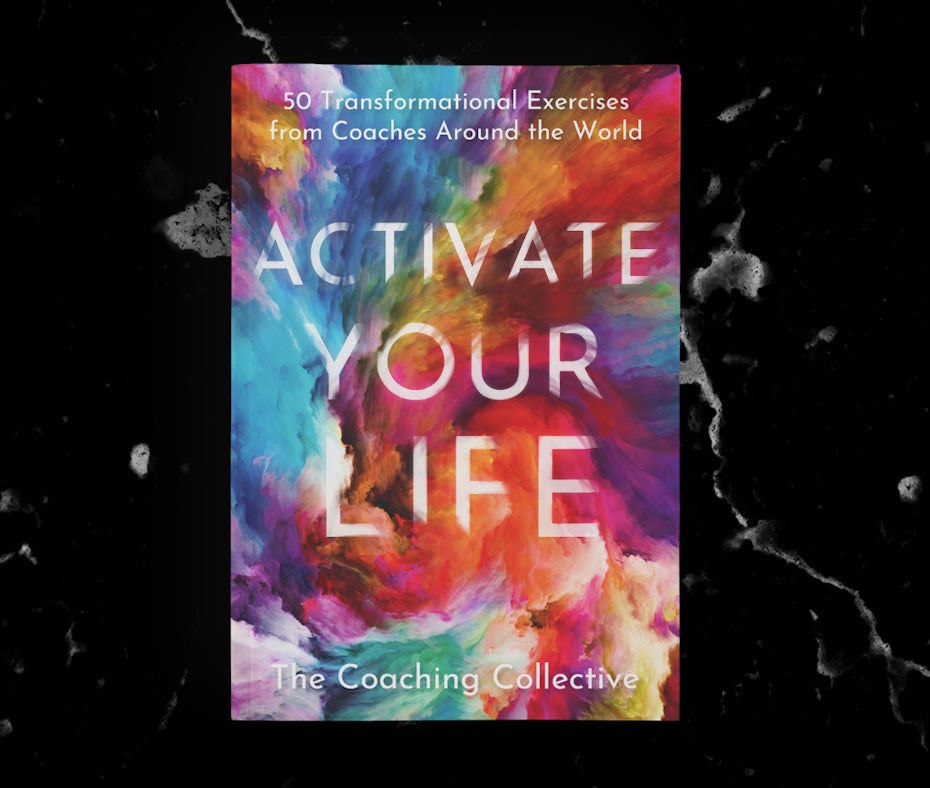
Design a rainbow gradient
If you want to keep the rainbow family together—instead of separating or subtracting each hue—you can also blend the colours with a trendy gradient.
Though the natural rainbow is comprised of bars of colour, these are not divided neatly by the rigid lines we see so often in design. The rainbow is a transient visitor, made out of mist and light. A gradient mimics its smooth and ethereal appearance. And considering that the rainbow is often used as a symbol of togetherness, blended colours are great at reinforcing this metaphor.

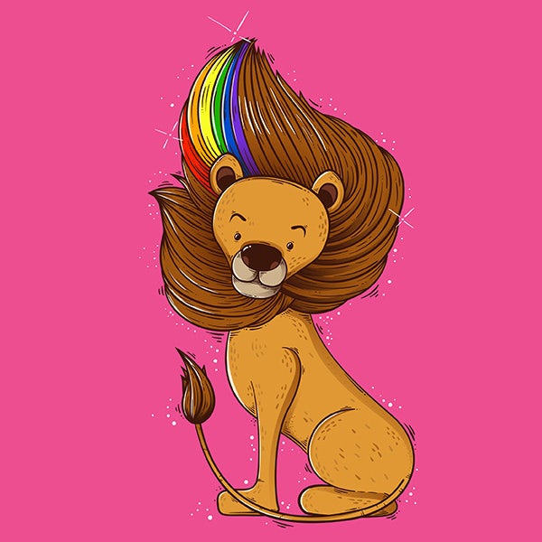
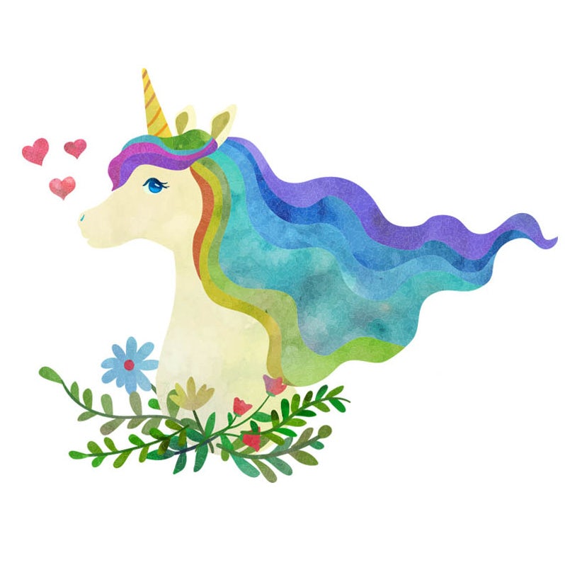
Maybe you’d like to show off your design’s rainbow side, but you don’t want to overshadow all of its other awesome qualities in the process.
In that case, you can use an accent to work the rainbow subtly into specific parts of your design: an article of clothing or strands of hair, for example. This will give your design that show-stopping flair while still complimenting its other elements. You can also turn the rainbow into a hidden easter egg within the design—a pleasant surprise for the viewer.


Though the natural rainbow is full of transparency and texture, it is often flattened to work within design trends. Adding texture is a simple way to create visual interest and keep your rainbow from looking like every vector design on the market.
Texture also creates shading and depth, making the colours much less stark than they would be in their flattened form. Consider some of the uses of texture pictured below, including paint strokes, smoke, mosaic tiles or subtle 3D shading.

by Daria V.
by UnicornTail
by BrandWorks™
by Dara T.
 By Maria Stoian
Reshape the rainbow
Traditionally, the rainbow is portrayed in full or semi arcs (like in nature) or in horizontal bars (like the Pride flag). Because we are so used to these incarnations, changing the shape is a great way to add surprise and unpredictability in your rainbow design. Try morphing the rainbow into a specific shape like an open flower or going fully modern with an abstract form. The colours themselves might stay the same, but by giving the rainbow a new figure, you’ll have everyone asking, “Who is SHE??”
by Carra Sykes via Dribbble
by SmartStyle

On the other hand, the rainbow’s familiar shape can be an asset all on its own.
Usually when you hear the word “rainbow,” the first thing you think of is the colours. But even without the colours, the vibrant arcs instantly conjure up visions of rainbow.
For a clever twist on your rainbow design, try eliminating the traditional colours and working only with the rainbow’s arcs. The rainbow might be as old as light itself, but it doesn’t have to be predictable or traditional.
by Carra Sykes via Dribbble
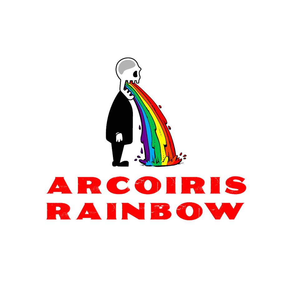
Many of the tips above are about toning down the rainbow, which is necessary to make it work for some design projects. But the rainbow’s unashamed boldness is often its best feature, the reason it has become a symbol for the marginalised, the oppressed and the decidedly original. Sometimes, the best way to harness the rainbow is to set off a rainbow bomb in your design.
That said, this approach tends to work best in situations where you don’t need a single element (like calls-to-action) to stand out since the composition as a whole will be loud. Don’t forget the methods we discussed previously—such as shape, texture and depth—to keep your rainbow vivid but surprising. As you design with the full force of the rainbow behind you, be fearless, but be sure to leave the Lisa Frank look back in elementary school where it belongs.

by Gui Zamarioli via Dribbble

by Jennifer Hood via Dribbble
By E·the·re·al”
by krlegend

By Vaieel via Dribbble. Check out Vaieel’s 30 days of Pride art.

Just as there are many colours in the rainbow, there are many, many ways to interpret the rainbow in design, much more than I’ve listed in this article. The rainbow is so full of vibrancy and symbolism, you’d be doing yourself a disservice to avoid its design potential. Even if its colours can be daunting to work with, amazing things tend to happen when designers are faced with a challenge. As mystical as it was thousands of years ago, you might say that today’s designers have made the rainbow more magical than ever before.
Click HERE for source.